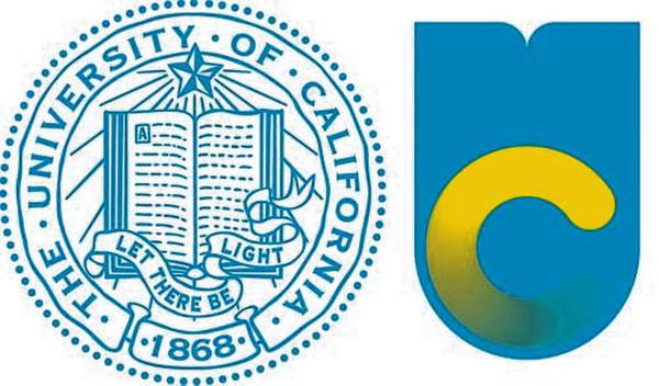
Momo has sent the new logo for our alma mater. It is observable above, to the right.
♦
♦
See also:
“Looks like a stylized bookworm. Because nothing says ‘the world’s best public university’ like a burrowing larva.”
“How appropriate that we’ve changed the logo to a stylized urinal.”
“Did Stanford design this?”
Axé.

Actually, it looks like a falling bomb which would be appropriate for a university which tried to buy an armored personal carrier on the sly for its campus storm troopers last year. Also appears to be a good candidate for Hobo jacket, a website where you can donate money to purchase jackets for the homeless with the logo of your rival university sewn on the front so people can see people sleeping on the street and say that’s what you achieve for graduating from THAT university.
Unbeluckingfievable. And how much did they pay somebody to come up with that? What was wrong with the old C that was used on athletic gear, if they had to replace the old emblem, and I don’t see why they did?
Falling bomb, very good point. Old C, that was what I thought.
Apparently some staff designed this in house. They may not remember the old C. And probably the old C is considered Berkeley only, so they want something totally new to be sure to fit the whole system.
At the Huffington Post you can see the disgusting promotional video UC made for this logo, and a lot of very funny anti-logo tweets. http://www.huffingtonpost.com/2012/12/10/university-of-california-new-logo_n_2270531.html
There is also a Facebook page (or two) against it and a change.org petition … and I think some other Bear Booster type pages, also against.
It’s bad. I can say that as grad of UCD.
Slide 10, from the post above, is a good summary of the badness: http://www.huffingtonpost.com/2012/12/10/university-of-california-new-logo_n_2270531.html#slide=1861134
Let the riots begin!
This is all a result of the corporatization of higher ed. There are graphics companies all over the country selling stupid branding ideas to universities. Mine unveiled a new “visual identity” — shocker — looks just like the other ones done by the same marketing firm. So much for “branding.” It is universally hated.
My current university branded itself with an obnoxious slogan which is printed on all our stationary and every possible object: Driven to Discover. Of course, this makes us all mutter, “Driven to Distraction.”